It's definitely cool art if you can wear it
If print design is fun, wearable design is awesome. ...Because people wear it around. How cool is that? :)
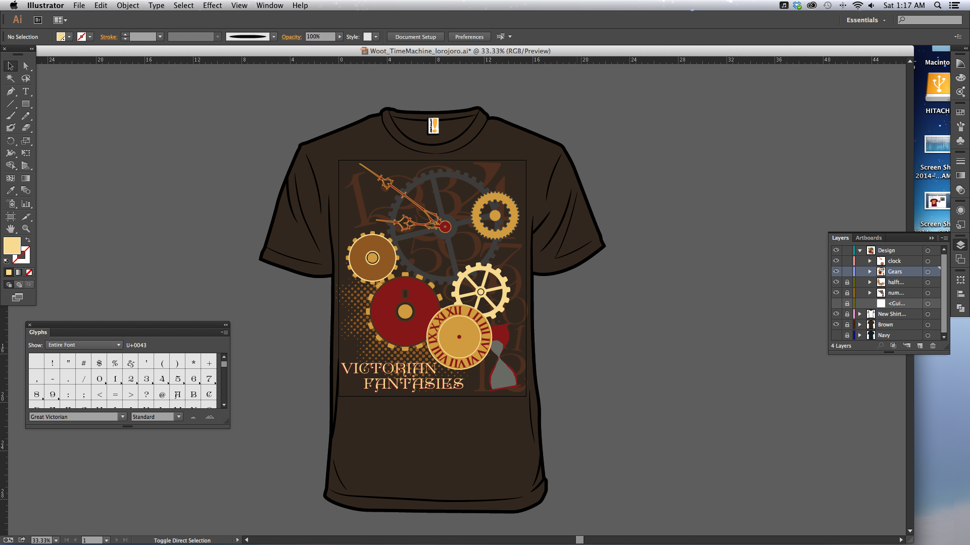
Been challenging myself to do Shirt.Woot's weekly derby design challenge. It's great practice and I enjoy the creativity outside my usual marketing stuff at work. This particular week's prompt was "Time Machines." Though the popular thing right now is to "put a Tardis on it!" I went with more of a Victorian steampunk take on the phrase. Time is certainly a machine running my life....
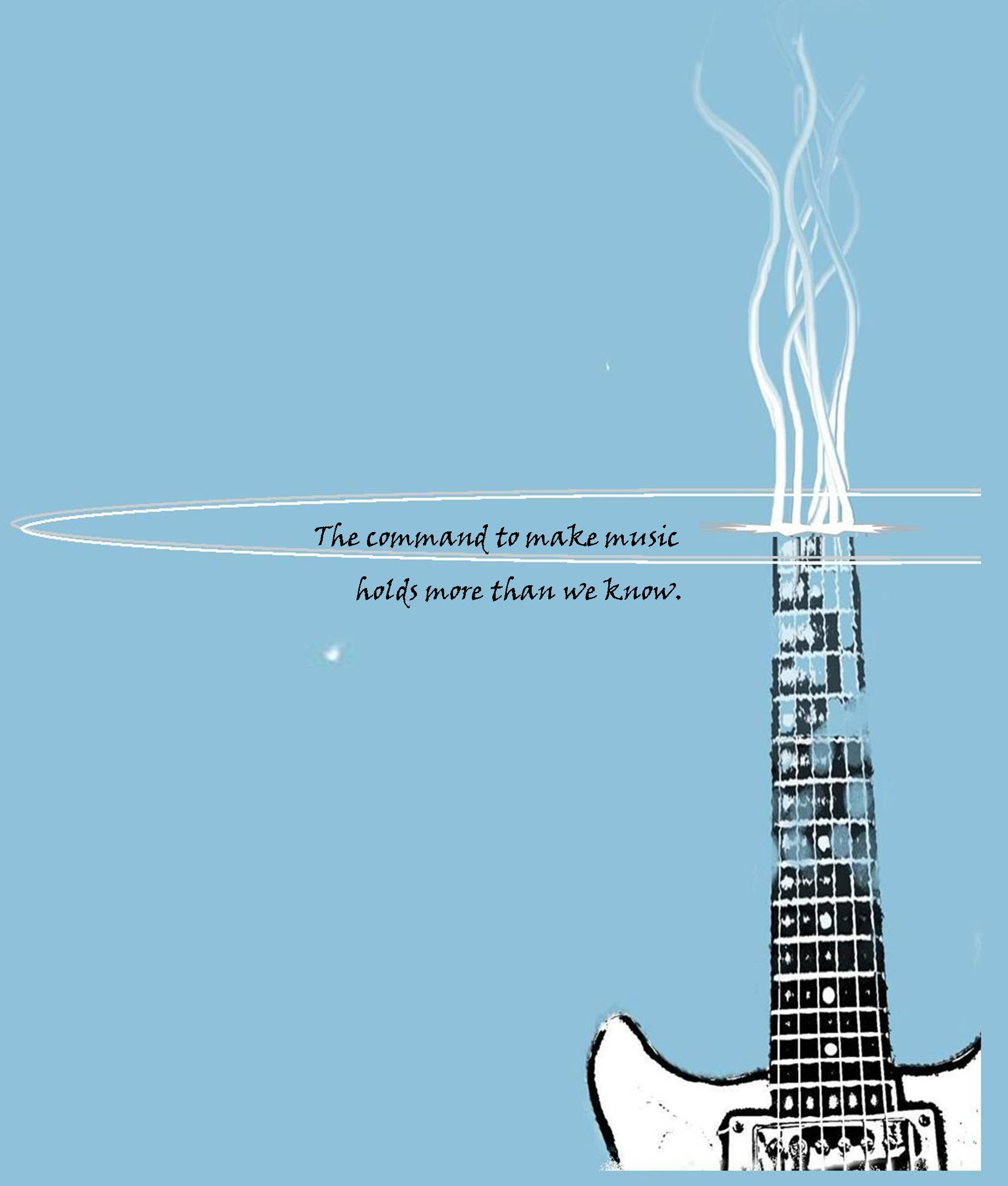
I worked on this shirt for the school musicians with two collaborators: Jesse James, who heaped me shoot his guitar and morph it into something cool, and Daniel Speer, whose creative drive pushed us toward a design that turned out really cool once we had it screen printed.

My upperclassmen (drama students) did a production of this classic Agatha Christie play, so we decided to commemorate it with a long-sleeved red shirt that mimicked the design of the show posters.
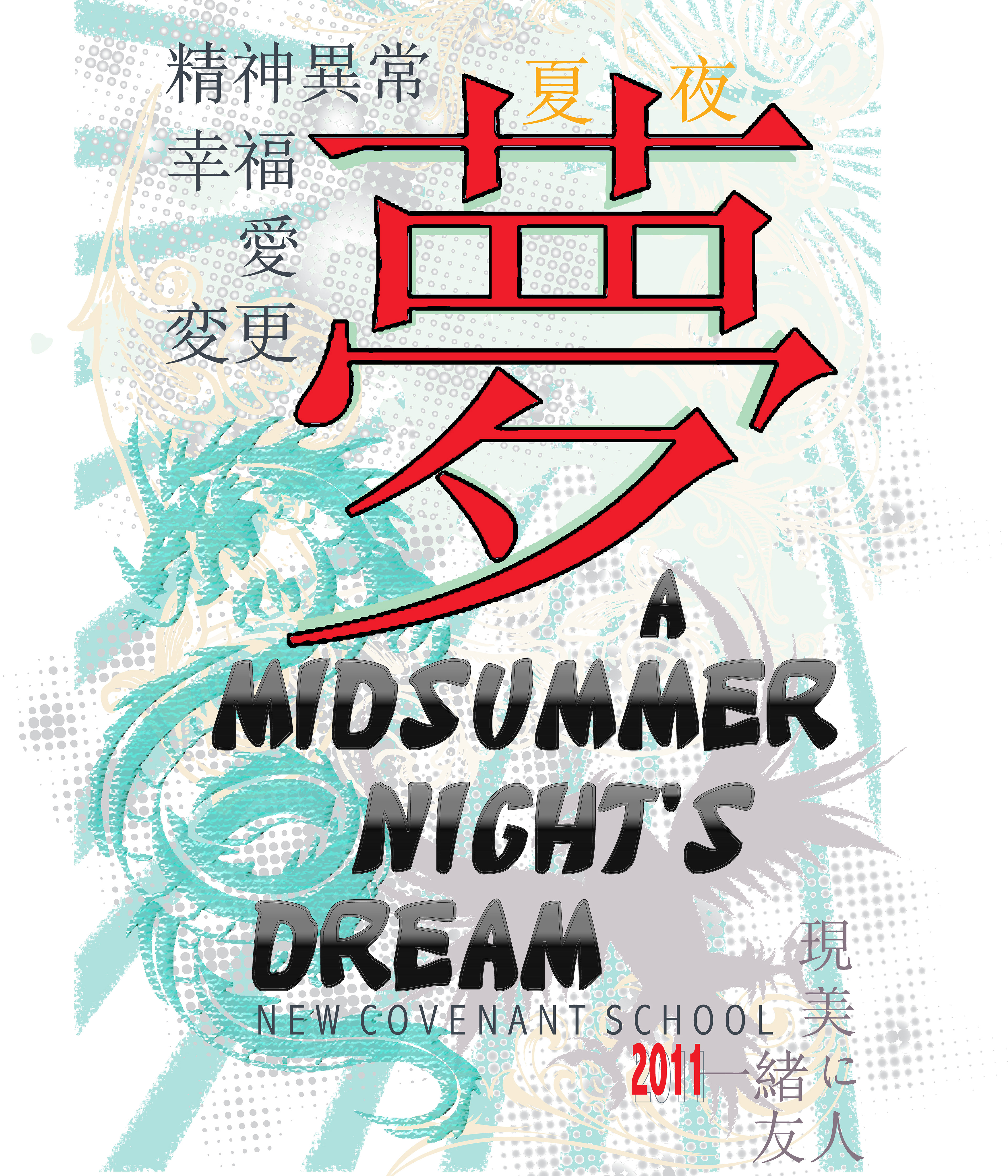
This is the front of a shirt to commemorate a Japanese-styled production of A Midsummer Night's Dream. The large red character is (I hope!) the actual Japanese character for "Dream."
The back of the shirt is below:
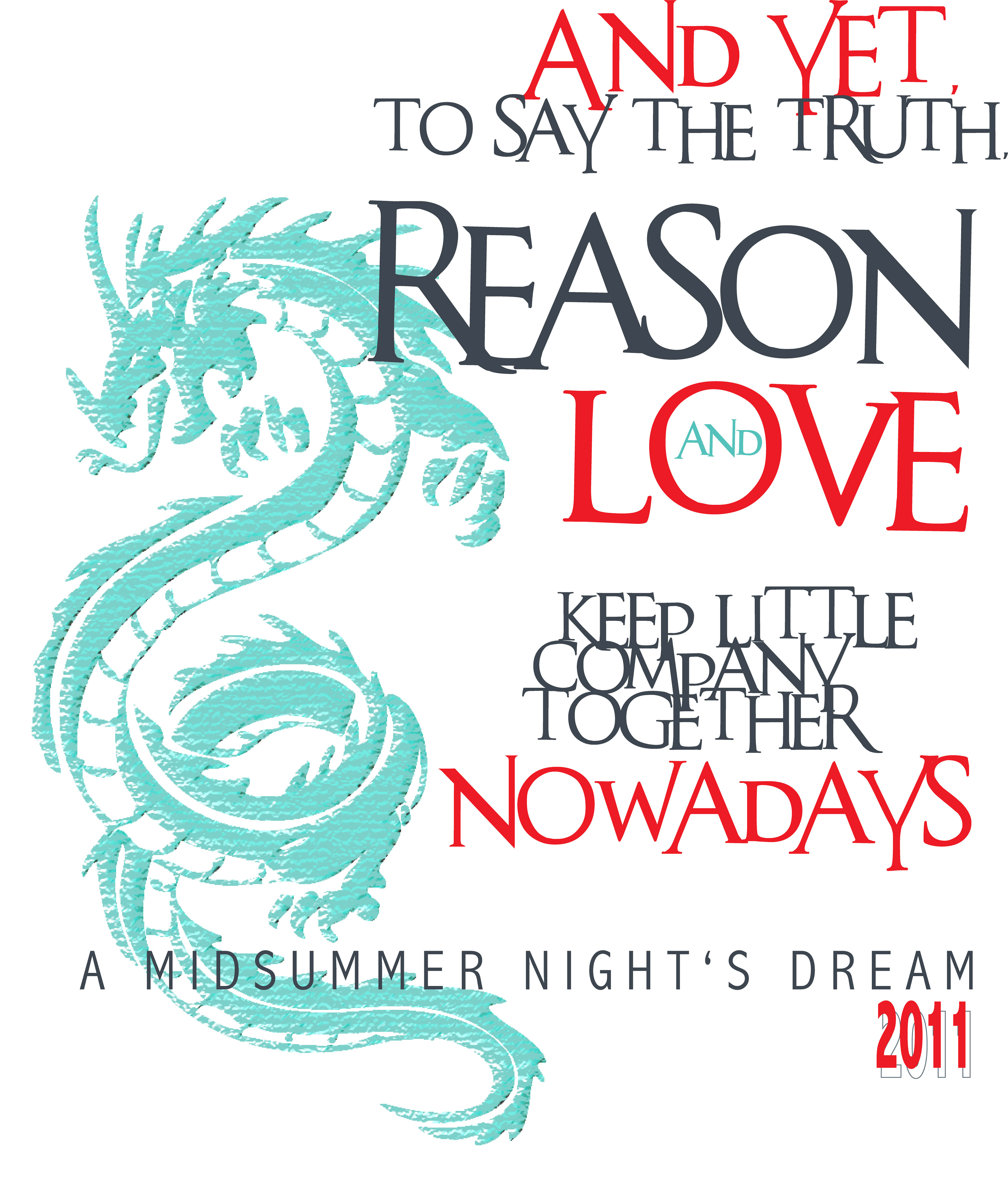
Back print for the shirt above
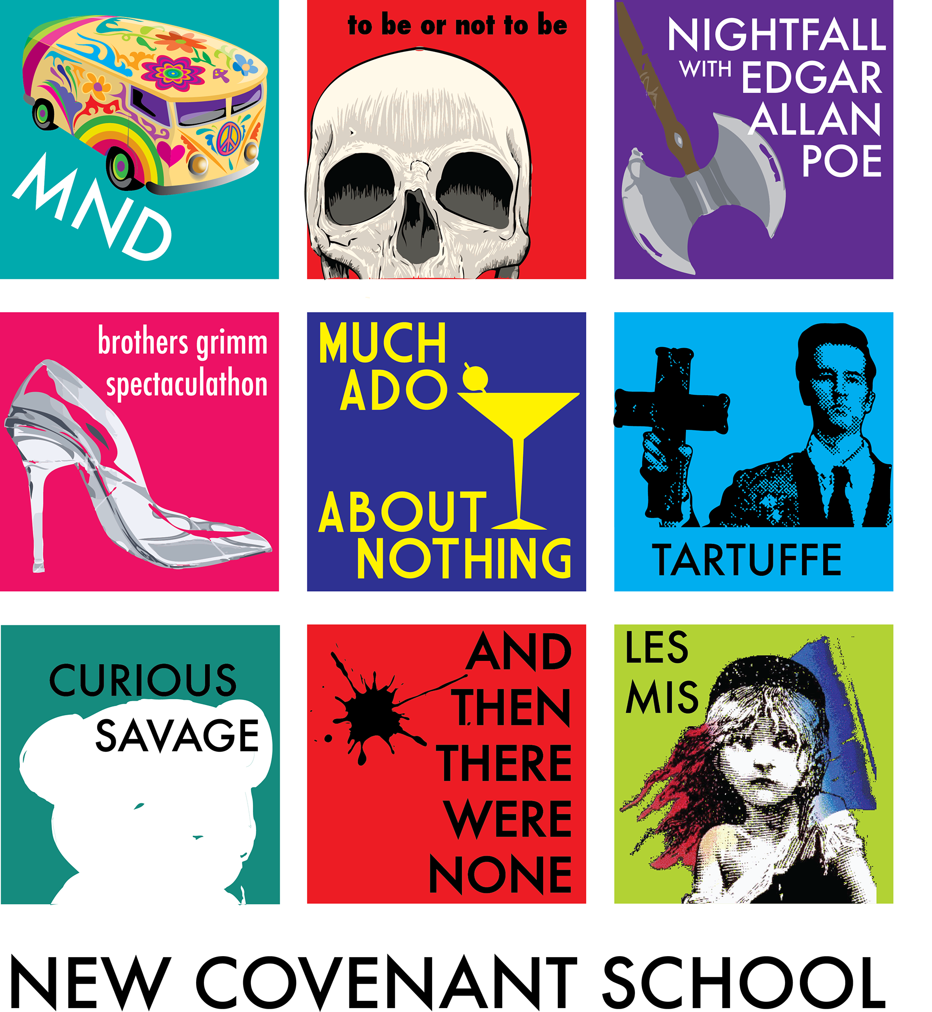
When I wrapped up 10 years working at a high school as drama teacher, we all decided a commemorative shirt was in order. This "tile" design (for the front of the shirt) represents the major shows we've done through the years at NCS. Students could opt to get a back design as well which incorporated famous quotes from various plays.
Very true.
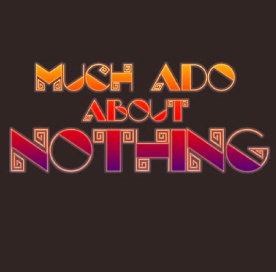
I like brown shirts. It's a good color on a lot of people, and it's not the typical black, blue, red, or white shirt. A couple years ago, the NCS Faculty did a production of Shakespeare's fine comedy, set in the 1920s. The show-biz font and bright colors match the production well.
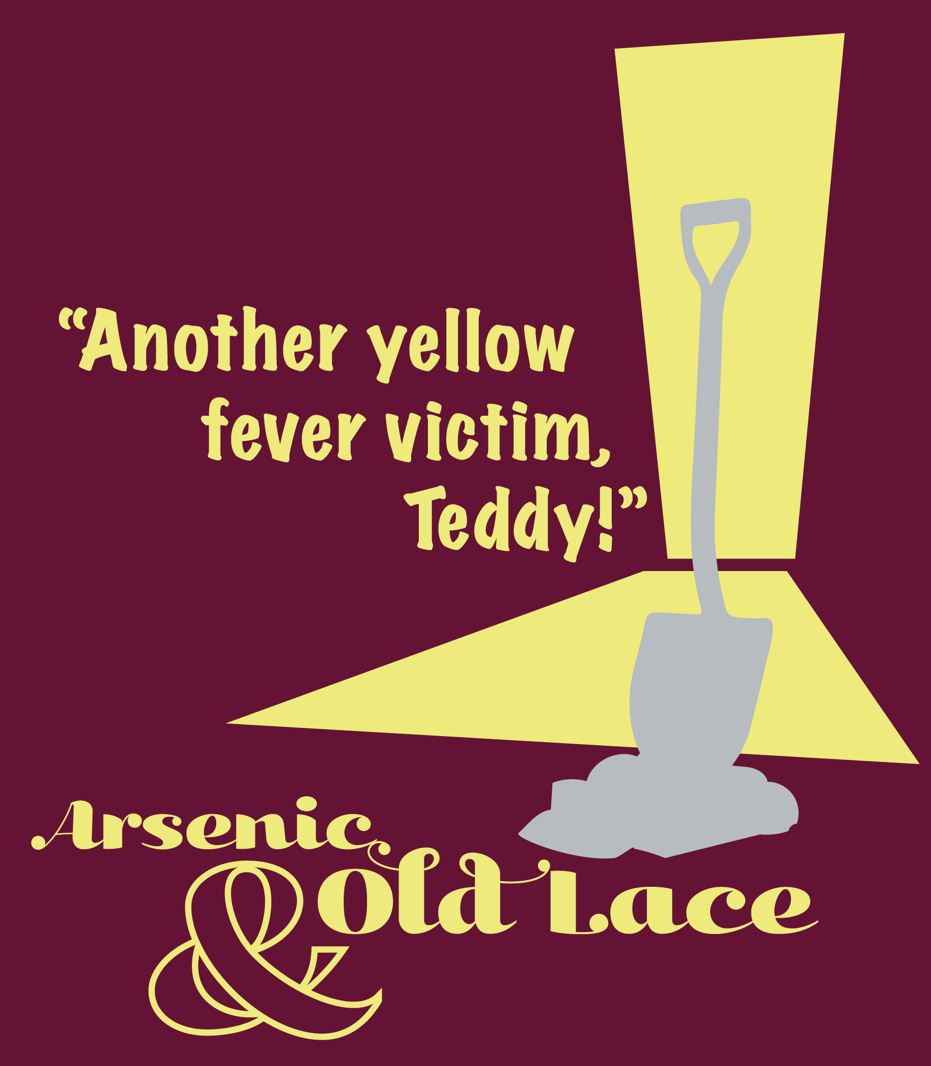
working on a shirt for a local school's production of Arsenic and Old Lace.
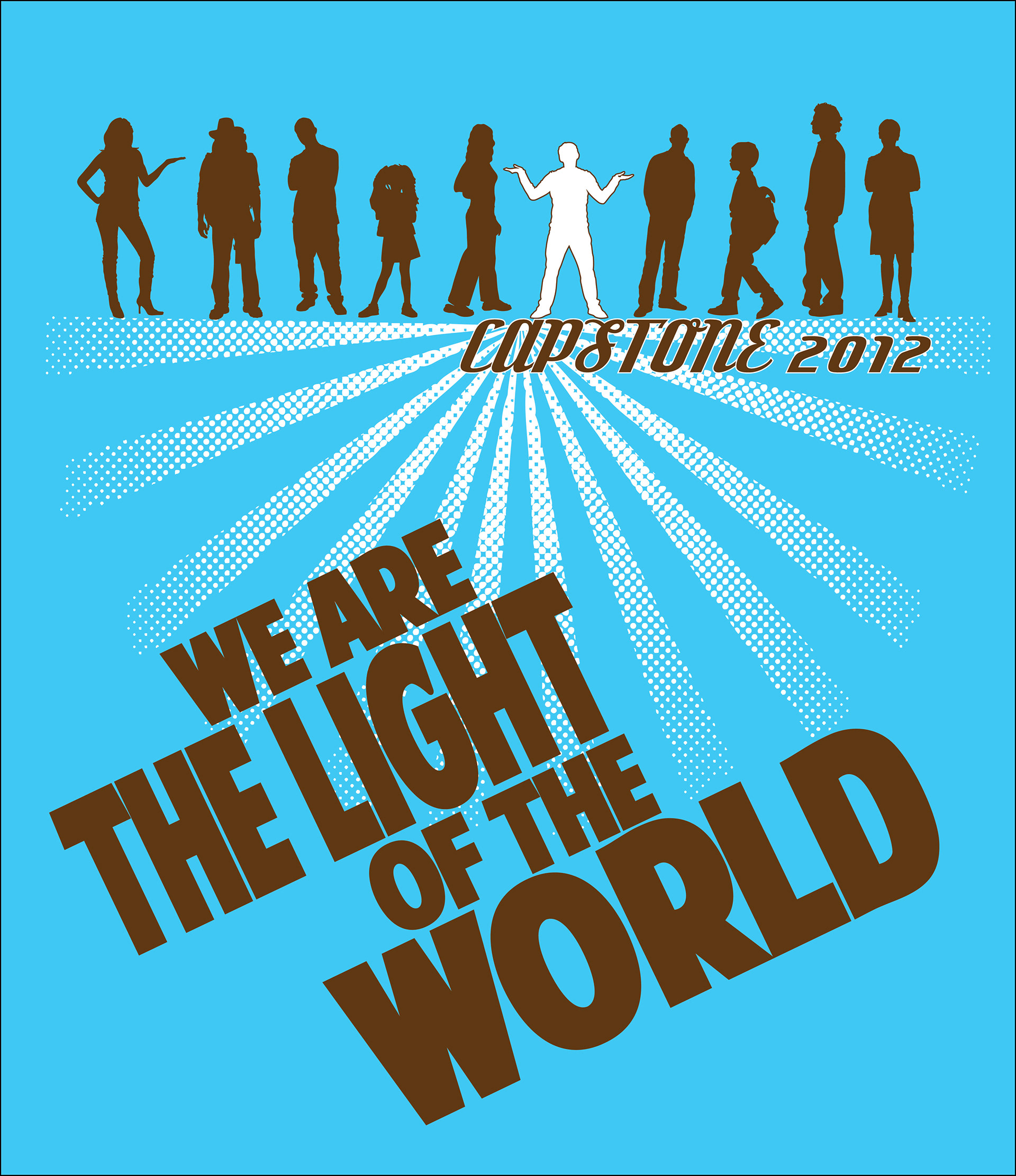
The youth at my church submitted designs for a youth group t-shirt. This is a working mockup of the winning design. Originally, the teen had suggested white and gray gradient on a black t-shirt, but I am uncomfortable with the stereotypical use of the color black as equivalent to people who don't claim Faith. So we switched it up, popped it onto new colors (students could choose blue or yellow shirts), and used a rich brown to complement the T-shirt hues. The accompanying verse on back says it all: "You are the light of the world -- like a city atop a hill cannot be hidden."

I really like yellow. :) Who isn't happy wearing a yellow shirt? This was a special series of 2 shirts for NCCYouth -- "Burn" refers to athletic outings, and "Bright" events are more cerebral, like game or movie nights. The companion shirt is below.

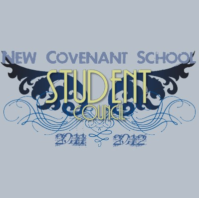
The student council at my school wanted a shirt they could wear. We didn't end up printing these, but the students were very positive about the design. Personally, i think the blue wings make the yellow print a little hard to see. Working on that.

Tartuffe by Moliere is a hilarious but biting French satire (from the 1660s) about religious hypocrisy. If you understand what point the playwright is making, you can't help but think about the ways people of religion tend to talk about being/doing good, but usually do the opposite. The Tshirt design wraps together a brilliant monologue by one of the secondary characters, in which Moliere really makes his point. This central theme monologue forms the darker brown cross on the T-shirt, surrounded by a sea of lies from Tartuffe, the central character and "impostor."